Hello everyone,
I suggest a better design, to make the interface more attractive and ergonomic, regarding the pictures and photos presentation:
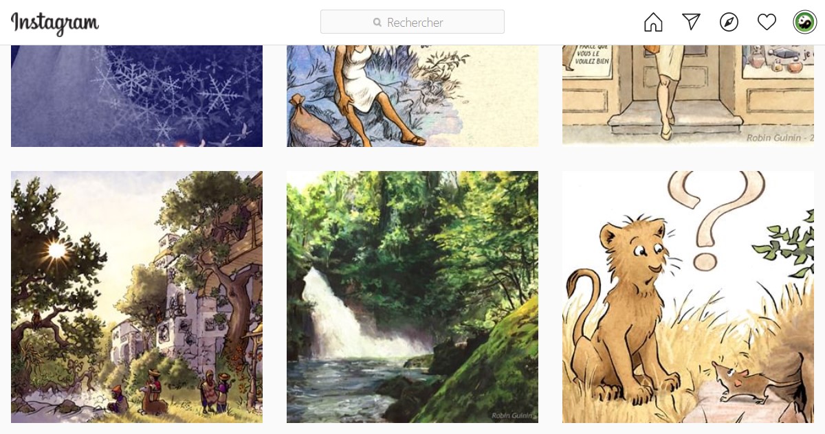
In the actual presentation, the pictures are too small and the margin between them is too large. Indeed, it should be better with a full screen presentation (or near full screen).
I added screenshots from Instagram to show you how a better presentation would look like.
I’m an illustrator and graphist, so this aspect is very important for me, but I presume it is also very decisive for all people who work with pictures/photos.
1 Like
