In my opinion the visualization of posts which contain multiple images needs a redesign - in the desktop and even more in the mobile version. I will start with the desktop version first.
What bothers me is, that the first image is huge, while all other images kind of disappear in a small bar below. As there is no option to caption images currently I usually write a single line of text as description in the post. That text is shown even below the tiny image bar and thus easily overseen.
I use my pod mainly to share photos / memories with my family, so in my posts the photos are the primary element. But we have to keep in mind that other people just attach images e.g. as an appetizer to longer stories.
So I’d like to find a new visualization for galleries, where all images are equally represented or it is at least noticable that there are images appended. Personally I prefer a justified tiled visualization, like here: http://unitegallery.net/index.php?page=tiles-justified-various#text_panel. On that page more examples can be found.
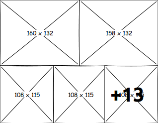
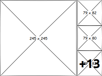
Also it might be good to only show a limited number of photos (between 5-8) and if more exist show an indicator (+13). Another idea is to show a slideshow embedded in the post, so one can scroll through the images right in the stream without opening the overlay.
Mockups:

Try to show all images with equal size, limited to 5.

Show other images at the right, instead of bottom, so they are easier to see.

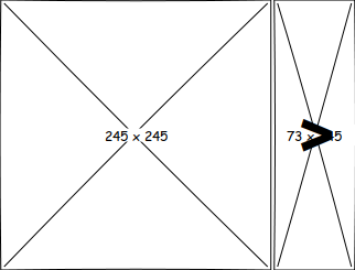
Slideshow like gallery.
I’m open for any suggestions. I still did not figure out how to properly visualize the posts text. Any ideas?
 - I got the copyright of the pictures.