I suggest a simple redesign on the interaction buttons on posts and the actions that they trigger for the mobile interface. The proposed redesign would solve many current issues with these buttons. Unfortunately, I do not have the skills to code this stuff personally, but since I have opened a couple of bug reports on the problems of the mobile interaction buttons and noticed some more problems that I haven’t yet reported, I started to think how could they be solved at once. If no-one has big objections on this suggestion, I am happy to open a feature request on Github on this; but I figured out that I should maybe suggest this here on Loomio first. I repeat once more: everything in this suggestion concerns only the mobile interface.
Here is a mock-up of the suggested basic redesign changes:
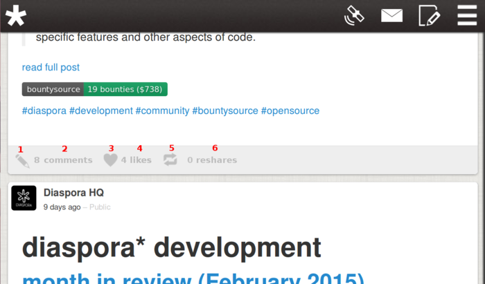
The location of the icons is not the point of this suggestion. Important here is that visible texts are added and clicking the icons and the texts would trigger different actions, which would be the following:
1. Clicking on the Pencil icon: Opens the existing comments (if any) and a comment box, and focuses on the comment box. If the “N comments” link and the comment button (see the next point) has been clicked earlier, clicking the icon just focuses on the comment box.
2. Clicking on the “N comments” link: Opens the existing comments. Below the comments there is a comment button; clicking on that button opens a comment box.
3. Clicking on the Heart icon: Adds / removes a like.
4. Clicking on the “N likes” link: Opens a list of people who have liked the post.
5. Clicking on the Reshare icon: Makes / removes a reshare. In both cases opens a confirmation dialog.
6. Clicking on the “N reshares” link: Opens a list of people who have reshared the post.
General advantages in comparison to the current design:
-
One would be able to see instantly, how many comments, likes and reshares a post has. This, I think, is the single biggest advantage of the suggested redesign.
-
With the addition of texts (N comments / likes / reshares), the meanings of the icons would be instantly clear even to newcomers. Nowadays, especially the meaning of the Reshare icon could be unclear for a newcomer.
-
The vague and redundant term “reaction”, which is used nowhere else in the interface, is removed. The term is vague, because it is not self-explanatory and because it is not clear, why it includes only likes and comments and not reshares, like it does now. The term is redundant, since no-one is interested in the sum of comments, likes and reshares, but only about their amounts separately. [EDIT: An issue was opened about the confusing “reactions” link on Github. This suggestion would solve it.]
Advantages of particular redesigned actions:
1. Clicking on the Pencil icon: This would solve https://github.com/diaspora/diaspora/issues/5483 Additionally, at the moment, clicking the Pencil icon does not open the existing comments but only the comment box. However, opening them makes sense, because in most cases you want to read earlier comments before commenting yourself.
2. Clicking on the “N comments” link: At the moment, the existing comments are opened by clicking the vague text “N reactions”. “N comments” is a self-explanatory text, unlike “N reactions”.
4. Clicking on the “N likes” link: At the moment, it is not possible to see who has liked a post. This would solve https://github.com/diaspora/diaspora/issues/5688 It is up to the coder to decide how the list of likers is best shown.
5. Clicking on the Reshare icon: At the moment, it is not possible to remove a reshare by clicking the reshare icon again. Removing a reshare in this way would be intuitive, because it is possible to remove a like this way too. (I once instinctively tried to remove a reshare like this and was surprised when it didn’t work.)
6. Clicking on the “N reshares” link: At the moment, it is not possible to see who has reshared a post. There is no bug report on that. It is up to the coder to decide how the list of resharers is best shown.
Please let me know, if something was left unclear.
Note: This discussion was imported from Loomio. Click here to view the original discussion.

