Stream should include an option to view posts as a list (twitter) or tiled (google+ style). List is great for mobile viewing, but tiled view is more useful for desktop and tablet displays, especially if you follow many active people/groups.
1 Like
Hi and thank you for your suggestion. I never used G+, can you please provide some mockups / screenshot of what you’re describing as “tiled view”?
Hi Flaburgan,
I’ve attached a screenshot. They use a flexbox layout, similar to bootstrap4, that defaults to 3 columns with fixed width (based on percentage), which shrinks to 2 columns then 1 column as the screen size gets smaller (e.g. desktop to mobile).
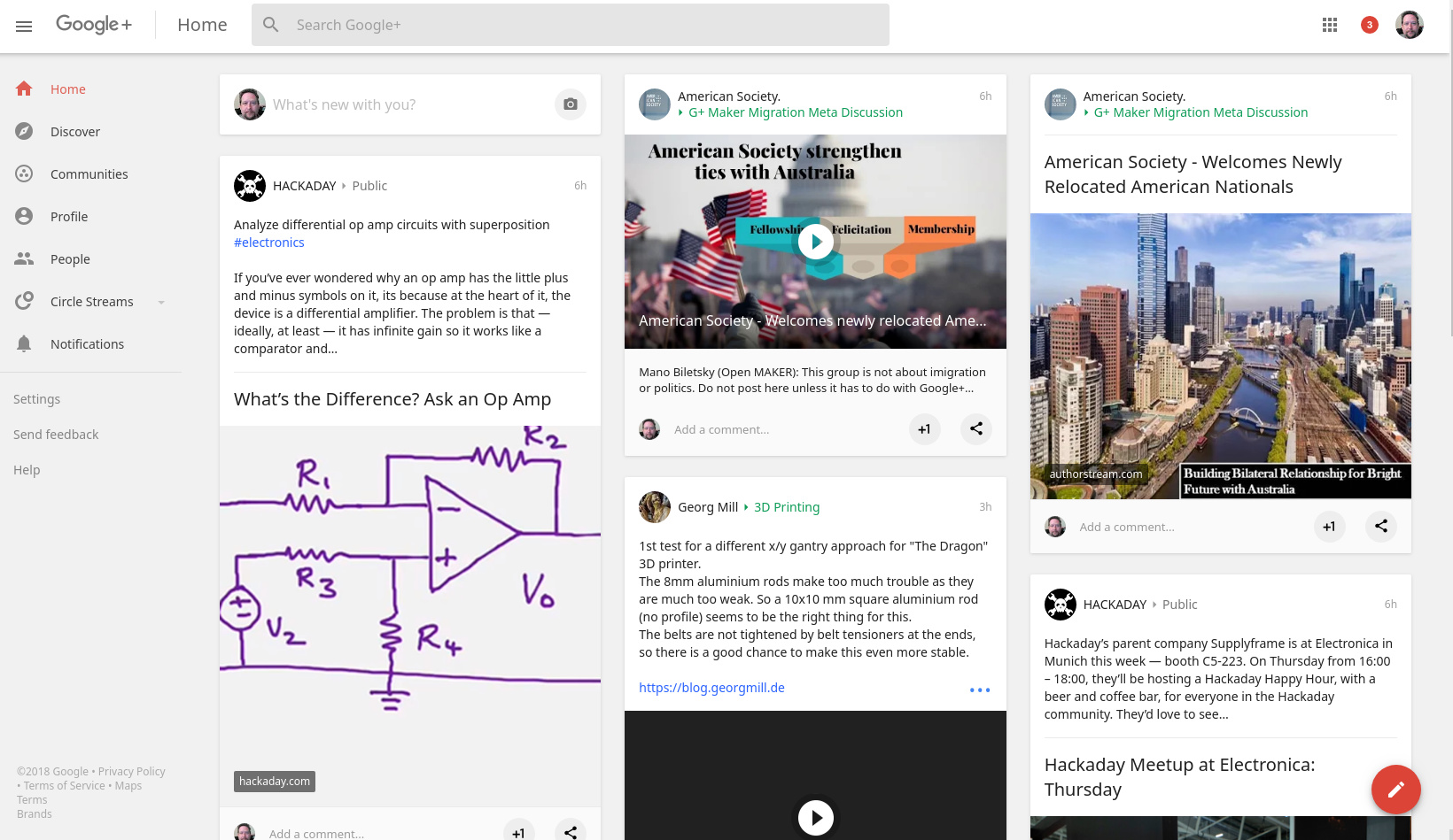
Ah, that looks like the diaspora* ‘beta’ design of 2011, that never got completed. Socialhome (another, newer federated project) uses a similar view. I like the layout concept, and would be very happy for something along those lines to be added as an option. Probably not the default, as I suspect the majority of users would like to keep a stream (‘bog-roll’).
1 Like
What’s the reading direction there? Top to bottom, then next column? Left to right? This is super confusing to me, and feels kinda cluttered… 
1 Like
@denschub It’s like a newspaper or magazine. top-bottom, left-right. When new posts are available, a ‘view (n) new posts’ appears at the top which you click to load them. Personally I’d prefer it auto-loaded them, unless you’re scrolled down.
In most cases the reading direction from one post to another won’t be important, because the posts won’t be connected to each other so the exact chronological sequence isn’t crucial. You can read them down, across, and it’ll still make just as much sense – or just as little sense, going by what’s usually in my stream…
1 Like
[quote=“denschub, post:5, topic:2112”]
What’s the reading direction there? Top to bottom, then next column? Left to right?[/quote]
Myself I used to read G+ stream as well as magazines more or less randomly, just glancing all over the page because usually not everything catches attention.
It works pretty well as it saves a lot of scrolling and makes easier not to miss posts you find genuinely interesting.