The capitalisation on Diaspora is all over the place.
Can we pick an agreed method and get it rolled out across the board please?
If you look around you’ll see some items are all ‘lower case’, others have ‘A Capital For Each Word’ and some are ‘Capital letter only on the first word’.
It’s a mess.
Some quick examples of what I mean, there are no doubt many more:
Note: This discussion was imported from Loomio. Click here to view the original discussion.
I agree, something must be done. It doesn’t help D* to look other than “home made”.
I don’t know the orthographic/writing rules enough, but i think it can depends on the language we use. In German, each noun has a Capital. In French, we use to Capitalize only the first letter of the first word. A solution could be (In my humble opinion) to capitalize completely the menu bar, and lesser a bit the font size.
I agree that the mixing of capitalization gives a loose impression, however I don’t think that the difference of capitalizations in the different parts of the site is a big problem.
For example, that the entire footer is in lower case I don’t see as a problem. Neither do I think the capitalization of every word in the toolbar is an issue. However I believe that the different phrases that belong to the same element should have the same capitalization, to keep the consistency.
English has culturally developed specific rules for capitalization — however they were decided by the media, such as “The Chicago Manual of Style”, which is one of the most popular styles. The reputation of a capitalization standard became proportional to the reputation of the newspaper(s) that make(s) use of it.
I always refer myself to this online tool when I write titles:
It’s simple to use: just type your title and it gets auto-capitalized correctly according to certain rules. As you can see with this tool, here’s how I see the future of diaspora* capitalization:
“Log Out”
“Invite Your Friends”
“Welcome New Users”
“Need Help?”
“My Activity”
“Start a Conversation…”
“About 3 Hours Ago”
“What’s New?”
“Toggle Mobile”
“Terms”
You can debate with me about the fact that there are alternatives to the Chicago Manual of Style, or that using capitals “everywhere” looks “ugly”. However, http://www.titlecapitalization.com/ makes this style very convenient to follow. Plus, following it would make diaspora* feel definitely more professional.
I’d like to note that most of these examples actually aren’t titles, so applying title capitalization makes no sense to me and especially for the “About 3 Hours Ago” it looks very ugly to me. Actually from the examples visible on the screenshots, only “Stream”, “Invite your friends”, “Welcome New Users”, “Need Help?” and the “My Activity” above the stream, not the one in the header bar or the left side bar, are titles.
The only exceptions I would accept in the example are “Start a conversation…” and “about 3 hours ago”. The rest should be capitalized, especially “Log Out”.
In fact, these part of text are really not titles as there’s no following text… I can only speak for french but the rule is to avoid capitalisation as much as possible. Generally, only the first letter of a sentence. In this case, the first letter of each item of a list. That’s all. Even though the first letter of each word of a title was capitalized a few years ago, this way of doing is starting to disappear.
Wow, I’m amazed by how wrong you define titles and how bad you see capitalization. Capitalization is professional-looking in English. It’s not the case in French, but don’t start mixing French rules with English rules, this is wrong! Le français a ses propres règles que l’anglais n’a pas! Laissez à Molière ce qui est à Molière et à Shakespeare ce qui est à Shakespeare.
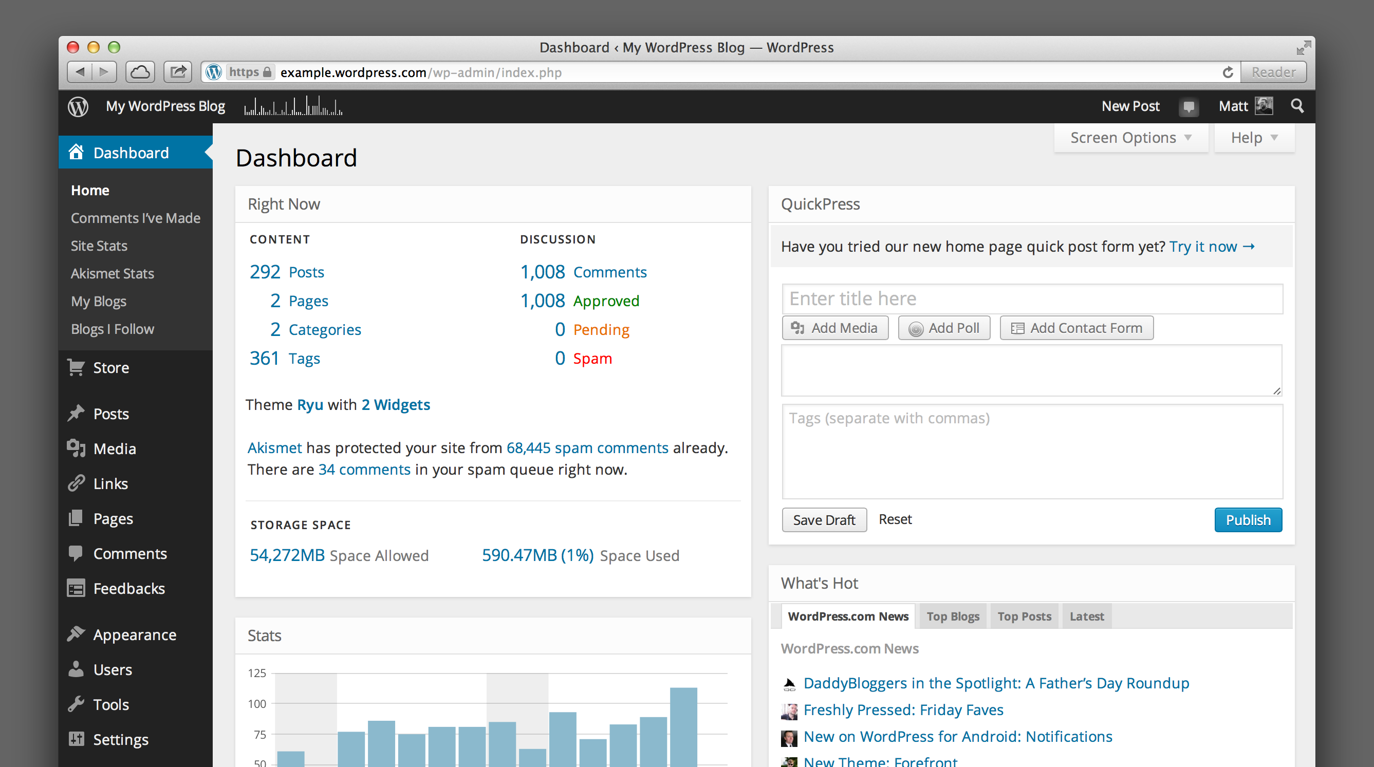
Want a good example? Look at the English version of WordPress. WordPress is professional-looking, and it does use capitals everywhere.
Admire the use of capitals! “Log Out”, “Comments I’ve Made”, “Site Stats”, “Right Now”, “New Post”, “Add Media”, “Top Blogs”, “Screen Options”, “Space Allowed”… Get it?
Are these titles? No! But we don’t care! If it’s not a long text string (a sentence or almost a sentence), then it must respect the capitalization rules.
So don’t start arguing with me that capitals are wrong, non-professional or old-fashioned. Capitals in English are a professional standard. It’s not related to brand, it’s not related to identity, it’s not related to beauty. It’s about English correctness.
In fact, there shouldn’t even be a Loomio discussion about that.
Yes, I agree: “Log out” should be rewritten as “Log Out”.
No, I disagree: Keep it as is.
Outcome: 9 people agreed, this is a minority.
7 people abstained, which is OK.
2 people disagreed and especially 4 people blocked, which is still quite important.
That shows the proposal is rather controversial. Further discussion should be taken before another proposal, and that next proposal should have a broader scale for the sake of consistency and simplicity.
Votes:
Yes: 9
Abstain: 7
No: 2
Block: 4
Note: This proposal was imported from Loomio. Vote details, some comments and metadata were not imported. Click here to view the proposal with all details on Loomio.